
Rewriting Orbit: what changed and why
After a few weeks of heads-down work, I’m happy to announce that I’m releasing a new version of Orbit. And this isn’t an incremental update. I’ve rethought how Orbit captures your screen, how it stores that data, and how you actually interact with it, because all of those things needed to change together.
The core idea is the same: Orbit records what’s on your screen so you can find it later. But the way it does that is completely different now, and I think it’s worth walking through what changed and why.
The recording engine
This is the part that changed the most. The old version was rather simple: every two seconds, Orbit took a screenshot, analyzed it and saved it to a database. I added deduplication at some point so consecutive captures with the same text on screen wouldn’t pile up, but fundamentally it was still capturing on a fixed timer regardless of what you were doing.
The new engine pays attention to how you’re using your computer. If you’re actively working, browsing and clicking around, it keeps the two-second interval. When it detects that you’ve stopped interacting, it backs off to every ten seconds. Deduplication still runs on top of that.
The difference in practice is pretty significant. I’ve been testing this for a few weeks, and the old continuous log just produced too many captures that were essentially the same thing. A screenshot of the same document every two seconds while you’re reading it isn’t particularly useful. What Orbit is actually for is finding the thing you vaguely remember seeing, and that doesn’t require capturing every two seconds. It also makes a real difference when you’re watching a video or a movie, because those captures are packed with unique pixel data and take up far more space than, say, a screenshot of a text editor.
All of this also means less load on your system, since the capture-and-analyze cycle runs less often. I’ve reworked how these captures and metadata get stored too, which should noticeably reduce disk space. I’m still figuring out whether I’ve been too aggressive with the throttling and fine-tuning different parameters. For now, based on my own daily use, it feels right.

Data mobility
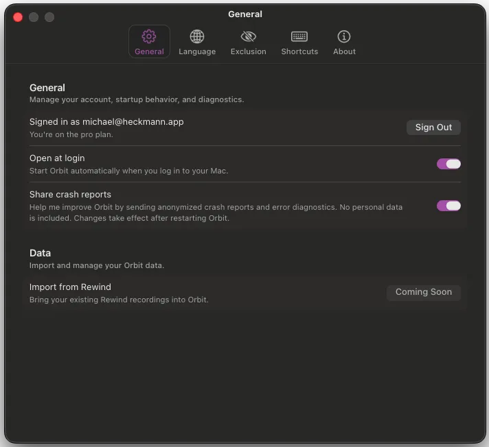
One thing I’ve heard consistently from early access users is that they want more control over where their data is stored. That makes sense. Even with smarter capturing you’re still accumulating a lot of recordings over time, and since everything is local, where that data lives on your machine matters.
I’ve built the new storage layer with this in mind from the start. None of the specific features are ready yet, but the architecture is designed to make things like these possible:
- Moving your storage location, either permanently or temporarily
- Splitting your recording history across different drives
- Keeping recent recordings on your main disk while archiving older ones somewhere else
- Eventually, storing parts of your data in a private cloud
This is one of those areas where the groundwork had to come first. The features themselves will roll out over the coming months.
The user interface
The old version gave you a Spotlight-style search bar when you opened it. You typed something, results came back. It worked fine, but there was always this implicit assumption that you already knew what you were looking for.
The new version starts differently. You press the hotkey and immediately see your most recent capture, displayed in a lightweight window that borrows from macOS’s Quick Look.
In a lot of cases you just saw something and want to get back to it, so having it right there when you open the app is exactly what you need. The old version couldn’t do this because the capture process had a delay built in. Now it’s instant. And beyond the practical use, it tells you something more fundamental: Orbit is working, it’s recording and ready to get you what you were looking for.

The window also gives you a timeline for the current day, broken down by hour. You can scroll through it or use arrow keys to jump around on your timeline. I’ve put some work into making the navigation feel right, though it’s not where I want it yet.
Search works and has a decent interface, but it’s not where I want it to be yet either. This is the part of the app I’m most looking forward to rethinking. I can see it going in a few directions, maybe living inside the Quick Look window, maybe becoming its own dedicated view, and I’m not sure which one will feel right.

The whole interface is designed for macOS Tahoe. Since Orbit is built with Electron and React rather than AppKit and SwiftUI, getting it to feel at home on the OS takes deliberate effort. You can get close to the native look, but you never quite get a perfect match, and things can land in uncanny territory fast. I’ve leaned into the native aesthetic in some places and taken more creative liberties in others. The goal isn’t to look like Apple made it. It’s to feel like a good citizen on your Mac, and to stand out through intentional design choices rather than because something feels off.
On the horizon
This release doesn’t have everything the old version had, and that’s on purpose. I wanted to get it out and start iterating rather than wait until every feature was done.
The first things I’m working on for parity are Rewind data integration and more recording configuration options, both of which should land within a couple of weeks. After that, the focus shifts to:
- A more powerful search interface with filters for metadata, time ranges, and app context
- Richer ways to interact with captures, like starring and adding notes
- Automatic data retention policies so you can keep only the last few months of recordings
- More flexibility around storage locations
- And much more of course!
If you want to try Orbit, head over to reachorbit.app and sign up for early access. If you have thoughts on any of this, I’d genuinely love to hear them. The search interface in particular is the most open design question right now. I’m on X.